
The Dashboard is the main landing page of Elements Pulse. It gives IT leaders an at-a-glance view of both operational health and employee experience across IT services, and helps identify where to focus attention and investment.
To access it, navigate to Elements Pulse in the Jira left-hand navigation menu and click Dashboards.
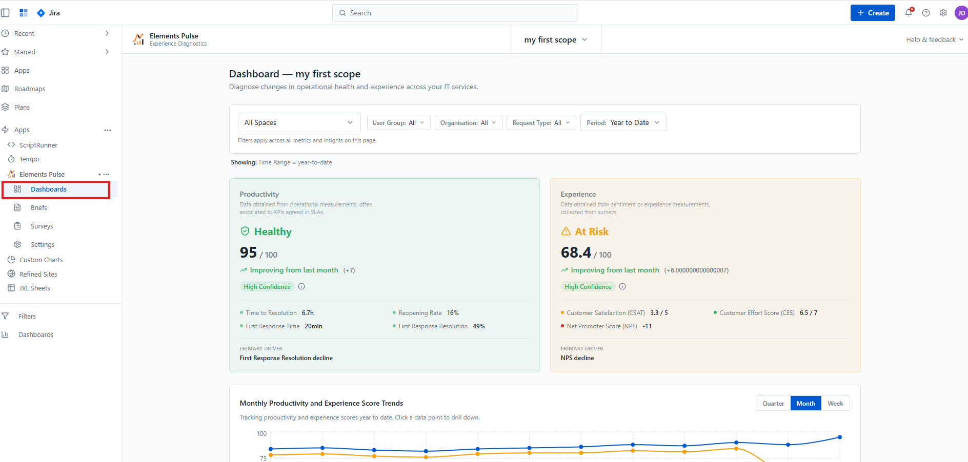
Filters
At the top of the Dashboard, a filter bar lets you narrow the data scope across all metrics and visualisations on the page simultaneously. Available filters are:
-
Spaces — filter by JSM project or space
-
User Group — segment by employee group
-
Organisation — filter by organisation
-
Request Type — focus on a specific category of service request
-
Period — select a time range (e.g. Year to Date, Quarter, Month)
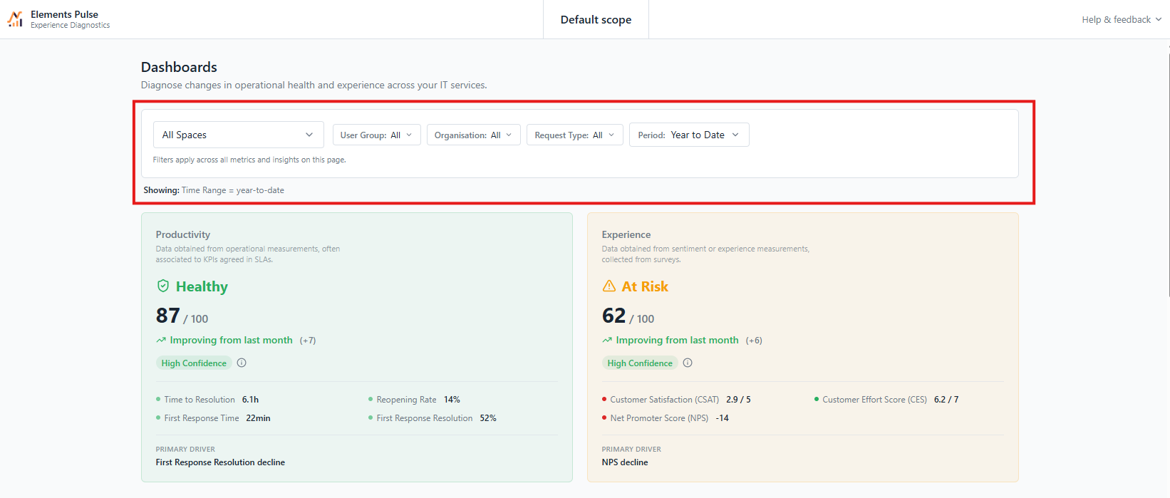
Productivity and Experience score cards
The Dashboard displays two score cards side by side, each scored out of 100:
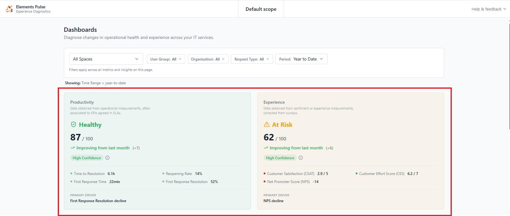
Productivity — data obtained from operational measurements, often associated with KPIs agreed in SLAs. It reflects how efficiently IT services are being delivered. Key metrics include:
-
Time to Resolution
-
First Response Time
-
Reopening Rate
-
First Response Resolution
Experience — data obtained from sentiment and experience measurements collected from surveys. It reflects how employees perceive and feel about IT services. Key metrics include:
-
Customer Satisfaction (CSAT)
-
Net Promoter Score (NPS)
-
Customer Effort Score (CES)
Each card displays:
-
A status indicator — Healthy, At Risk, or Critical — with a corresponding colour
-
The composite score out of 100
-
A trend vs the previous period (e.g. Improving from last month +7)
-
A confidence level indicating the reliability of the score based on response volume
-
The primary driver — the single metric contributing most to the current score, helping you identify where to look first
Monthly Productivity and Experience Score Trends
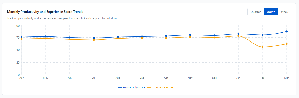
Below the score cards, a dual-line trend chart plots both the Productivity score (blue) and the Experience score (orange) over time. The chart can be toggled between Quarter, Month, and Week granularity.
Click any data point on the chart to drill down into the details for that specific period.
Focus Area Quadrant
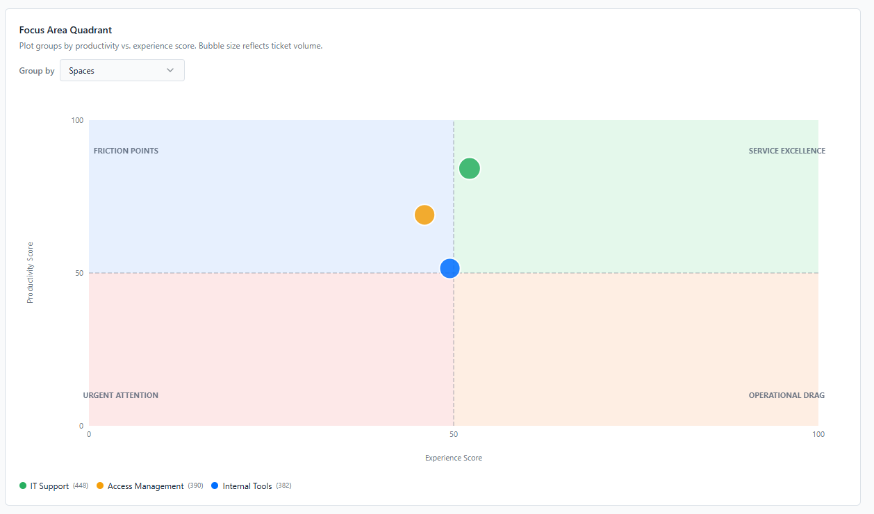
The Focus Area Quadrant plots groups of services on a two-axis matrix — Productivity Score (Y-axis) vs Experience Score (X-axis) — making it easy to spot where to act first. Bubble size reflects ticket volume, giving a sense of the scale of impact.
The quadrant is divided into four zones:
-
Service Excellence (top right) — high productivity, high experience. Services performing well on both dimensions.
-
Friction Points (top left) — high productivity but low experience. Operationally efficient but employees are not satisfied. Worth investigating what is causing the gap.
-
Operational Drag (bottom right) — low productivity but high experience. Employees are happy but the service is underperforming operationally.
-
Urgent Attention (bottom left) — low productivity and low experience. Services that need immediate focus.
Use the Group by dropdown to plot by Spaces, User Groups, Organisations, or Request Types, giving you different perspectives on where friction is concentrated.