
The Dashboard shows two score cards side by side, Productivity and Experience. Each one condenses several industry-standard IT service metrics into a single score out of 100, so you can tell at a glance how your IT services are performing, both in how efficiently they are delivered and in how employees experience them.
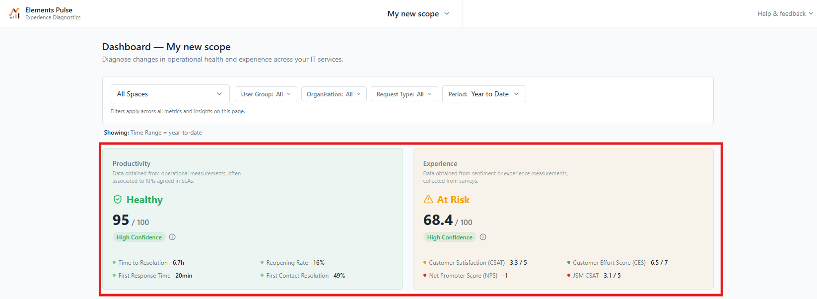
What each card shows
-
The score, out of 100.
-
A status, with a matching colour:
|
Status |
Score |
|---|---|
|
Healthy (green) |
70 or above |
|
At Risk (orange) |
50 to 69 |
|
Critical (red) |
Below 50 |
-
A confidence level, telling you whether there is enough recent data for the score to be meaningful. When there isn't, the card shows Insufficient Data: it means "not enough data to tell", not "the score is bad". For the Experience score, this is the case when there are fewer than 5 survey responses in the selected period, or no recent responses at all.
Click a card to see the detailed metrics behind it.
How the scores are built
Each metric is converted to a common 0–100 scale, where higher always means better, so they can be combined into a single score. For the full calculation details, see How Experience and Productivity scores are calculated .
Productivity metrics
The Productivity score measures how efficiently IT services are delivered, based on your Jira Service Management data.
Time to Resolution
What it measures: how long it takes to resolve a ticket, based on the "Time to resolution" SLA in Jira Service Management.
Why it matters: an average resolution time alone doesn't tell you much. A two-day average can be excellent for complex requests or unacceptable for password resets. What matters is whether you meet the targets you've set.
How it's scored: the card shows the average resolution time, but the score is based on the share of tickets resolved within their SLA goal. Resolving 95% of tickets within SLA earns the maximum score.
First Response Time
What it measures: how long employees wait for a first reply from an agent, based on the "Time to first response" SLA.
Why it matters: a fast first response reassures employees that their request has been taken into account, even before it is resolved. It is one of the strongest drivers of perceived service quality.
How it's scored: like Time to Resolution, the score is based on the share of tickets that received a first response within their SLA goal. 95% within SLA earns the maximum score.
Reopening Rate
What it measures: the percentage of resolved tickets that were reopened at least once.
Why it matters: a reopened ticket usually means the issue wasn't actually fixed, or was closed too early. A low reopening rate is a sign of resolution quality, not just speed. It is also the safeguard against closing tickets fast to meet SLAs.
How it's scored: lower is better. A reopening rate of 0% earns the maximum score, and the score drops to zero at 15% or more.
First Contact Resolution
What it measures: the percentage of resolved tickets handled with minimal back-and-forth, meaning tickets that received at most 2 public agent comments.
Why it matters: every extra exchange costs time for both the agent and the employee. Resolving issues without back-and-forth is one of the most reliable signs of an effective service desk.
How it's scored: higher is better. A rate of 70%, the benchmark for good performance in IT support set by SQM Group, earns the maximum score.
Experience metrics
The Experience score measures how employees feel about the IT services they receive, based on survey responses.
CSAT (Customer Satisfaction)
What it measures: how satisfied employees are with the help they received, on a scale from 1 (very dissatisfied) to 5 (very satisfied).
Why it matters: CSAT is the most direct measure of how a specific interaction was perceived. Collected right after a ticket is resolved, it captures the experience while it's still fresh.
How it's scored: the average rating is converted to the 0–100 scale: 1 gives 0, 3 gives 50, 5 gives 100. Responses from Pulse surveys and native JSM ratings are combined into a single CSAT, so satisfaction is counted once, whichever way it was collected.
CES (Customer Effort Score)
What it measures: how easy it was for employees to get their issue resolved, on a scale from 1 (very low effort) to 7 (very high effort).
Why it matters: research shows that reducing effort is a better predictor of loyalty than delighting users. An employee who had to chase, repeat themselves, or switch channels will remember it, even if the issue was eventually solved.
How it's scored: lower effort is better, so the scale is inverted: 1 gives 100, 4 gives 50, 7 gives 0.
NPS (Net Promoter Score)
What it measures: how likely employees are to recommend IT services to a colleague, on a scale from 0 to 10.
Why it matters: NPS goes beyond a single ticket. It reflects the overall trust and perception employees have of IT.
How it's scored: Pulse uses the standard Bain & Company method. Responses of 9 or 10 are promoters, 7 or 8 are passives, and 0 to 6 are detractors. NPS is the percentage of promoters minus the percentage of detractors, from −100 to +100, then converted to the 0–100 scale (−100 gives 0, 0 gives 50, +100 gives 100).
JSM CSAT
What it measures: the satisfaction rating collected natively by Jira Service Management, on a scale from 1 to 5.
Why it matters: many teams already collect these ratings. Pulse brings them into the Experience score from day one, even before you've set up your own surveys.
How it's scored: JSM ratings are shown on their own card for reference, and combined with Pulse CSAT responses in the Experience score (see CSAT above).