
Clicking the Experience score card on the Dashboard opens a dedicated page showing what lies behind the score: which survey metrics are pulling it up or down, how they have evolved, and which questions, groups, and tickets are driving them.
The drill-down has two levels: an overview of the Experience Score, and a deep dive into each metric.
Experience Score overview
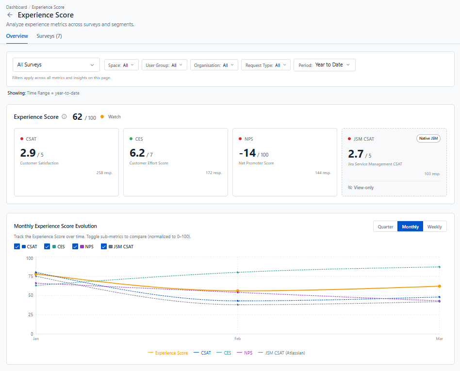
The top of the page shows your overall Experience Score out of 100, with its status, followed by the four metrics it is built from:
-
CSAT (Customer Satisfaction): how satisfied employees are with the help they received.
-
CES (Customer Effort Score): how easy it was for employees to get their issue resolved.
-
NPS (Net Promoter Score): how likely employees are to recommend IT services to a colleague.
-
JSM CSAT: the satisfaction rating collected natively by Jira Service Management, shown alongside Pulse's own surveys.
At a glance, you can see which metric is behind a drop or an improvement in the overall score.
The Monthly Experience Score Evolution chart shows how the score and each metric have evolved since the start of the year, on a common 0–100 scale so they can be compared directly. It helps you tell whether a weak metric is a recent drop or a lasting trend, and whether the actions you've taken are paying off. Use the checkboxes to focus on the metrics you're interested in.
The Surveys tab lists all the surveys feeding the score, so you can jump to any survey's results.
Use the filters at the top of the page to compare experience across spaces, user groups, organisations, or request types, or to focus on a single survey. The filters also apply to the deep dive pages.
Metric deep dive
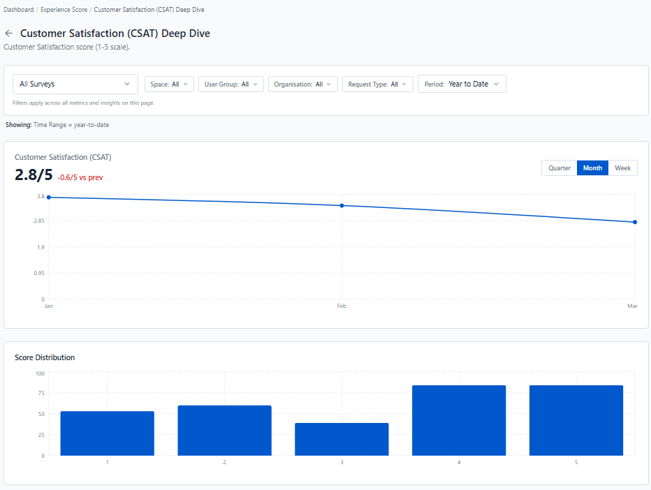
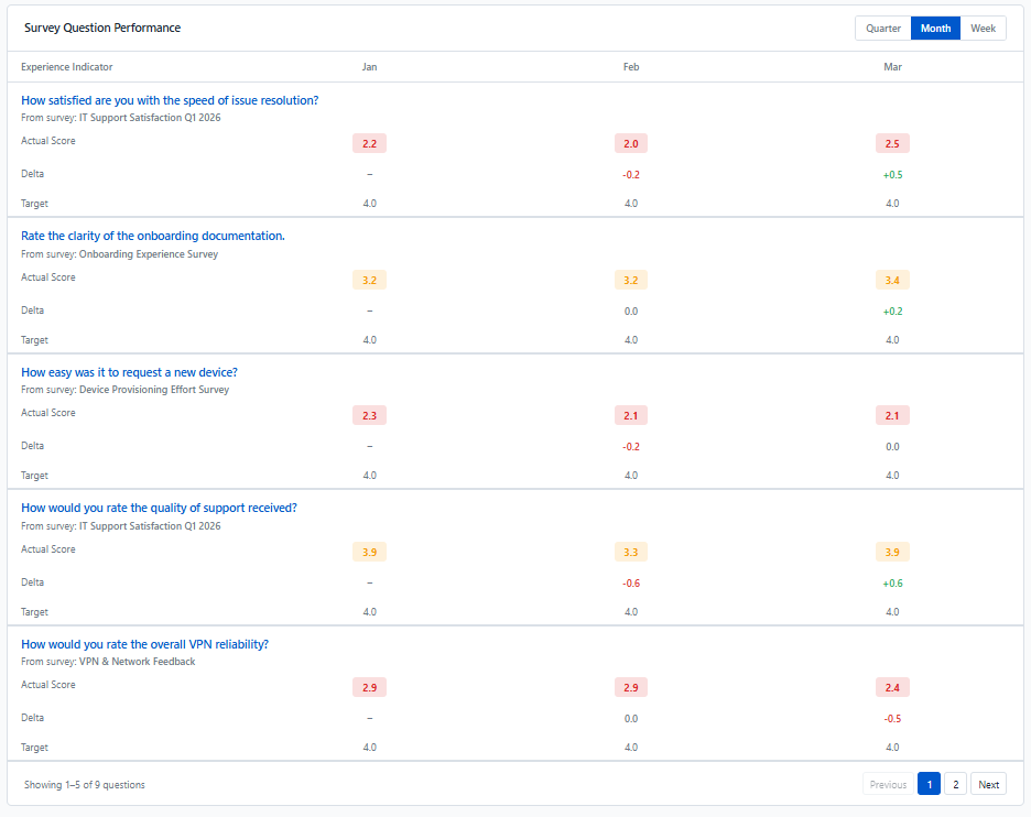
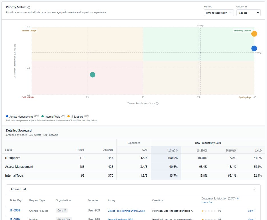
Clicking the CSAT, CES, or NPS card opens a deep dive page for that metric. It helps you understand where the score comes from and where to act first:
-
Trend: how the metric has evolved over time.
-
Score Distribution: how responses are spread across the scale. For example, an average CSAT of 3.5 can hide a group of very dissatisfied employees giving a score of 1.
-
Survey Question Performance: how each survey question feeding this metric scores month by month against its target, so you can spot the questions that consistently fall short.
-
Priority Matrix: compares experience with operational performance for each space, user group, organisation, or request type, then lets you go down to the individual answers and tickets behind them. It shows which groups to address first. (see Operational and Experience correlation ).