
The watermelon effect is what happens when operational metrics look healthy on the surface, with SLAs green and tickets closed on time, while the real employee experience underneath tells a different story. Pulse makes this visible by comparing operational data (from Jira Service Management) with experience data (from surveys) at three levels: over time, by segment, and down to individual answers and tickets.
Score trends
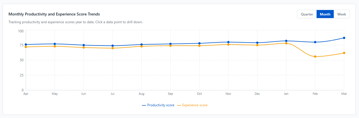
Below the score cards on the Dashboard, a chart plots the Productivity and Experience scores over time. You can see at a glance whether the two move together or start to drift apart, for example a stable Productivity score while Experience keeps declining.
Switch between a quarterly, monthly, or weekly view, and click any point to explore that period in detail.
Focus Area Quadrant
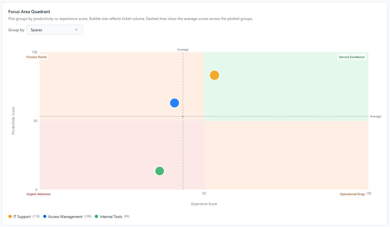
The Focus Area Quadrant positions each space, user group, organisation, or request type according to its Productivity and Experience scores. It shows where to focus your efforts first.
The chart is split into four zones:
-
Service Excellence (top right): good on both productivity and experience.
-
Friction Points (top left): operationally efficient, but employees are not satisfied. Worth investigating what causes the gap.
-
Operational Drag (bottom right): employees are satisfied, but the service underperforms operationally.
-
Urgent Attention (bottom left): weak on both. These groups need immediate focus.
Use the Group by menu to switch between spaces, user groups, organisations, and request types, and see where friction is concentrated.
Note: The Focus Area Quadrant only follows the Period filter and its own Group by menu. The other Dashboard filters (Space, User Group, Organisation, Request Type) don't apply to it.
Priority Matrix
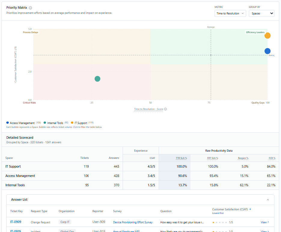
The Priority Matrix is available on the CSAT, CES, and NPS deep dive pages. For each space, user group, organisation, or request type, it compares the metric of the page you're on with one operational indicator of your choice: Time to Resolution, First Response Time, Reopening Rate, or First Contact Resolution. You can then go from a group-level pattern down to the individual answers behind it.
The chart is split into four zones:
-
Efficiency Leaders (top right): good experience and good operational performance.
-
Process Delays (top left): experience is good, but operational performance lags. Satisfaction is already there, so fixing the delay is the next step.
-
Quality Gaps (bottom right): operationally efficient, but experience is weaker. Speed alone isn't delivering a good experience, so it's worth investigating why.
-
Critical Risks (bottom left): weak on both. These are the most urgent groups to address.
Higher on the chart always means a better experience, and further right always means better operational performance. Dashed lines show the average across all groups displayed, so you can see which groups are above or below average.
Select a group by clicking its bubble, its legend entry, or its row in the table to investigate it further:
-
Detailed Scorecard: lists every group with its experience score and all four operational indicators, so you can read the exact figures behind each bubble. The selected group is highlighted.
-
Answer List: shows the individual survey answers for the selected group, lowest scores first, each linked to its ticket and survey. It lets you see exactly which requests and responses are driving a poor score.
Note: The Priority Matrix only follows the Period filter and its own Group by menu. The other filters on the page (Survey, Space, User Group, Organisation, Request Type) don't apply to it. On the CSAT page, the matrix uses Pulse CSAT survey answers only; native JSM CSAT ratings are not included.