
Elements Connect fields can be edited using different editors types.
Unlike standard Jira fields, the editor is not strictly a link to the field type: you can select the editor type after the field creation and change it afterwards from one type to another.
Select List
Supported
Single value MULTI value CASCADING
Not supported
USER INPUT HTML
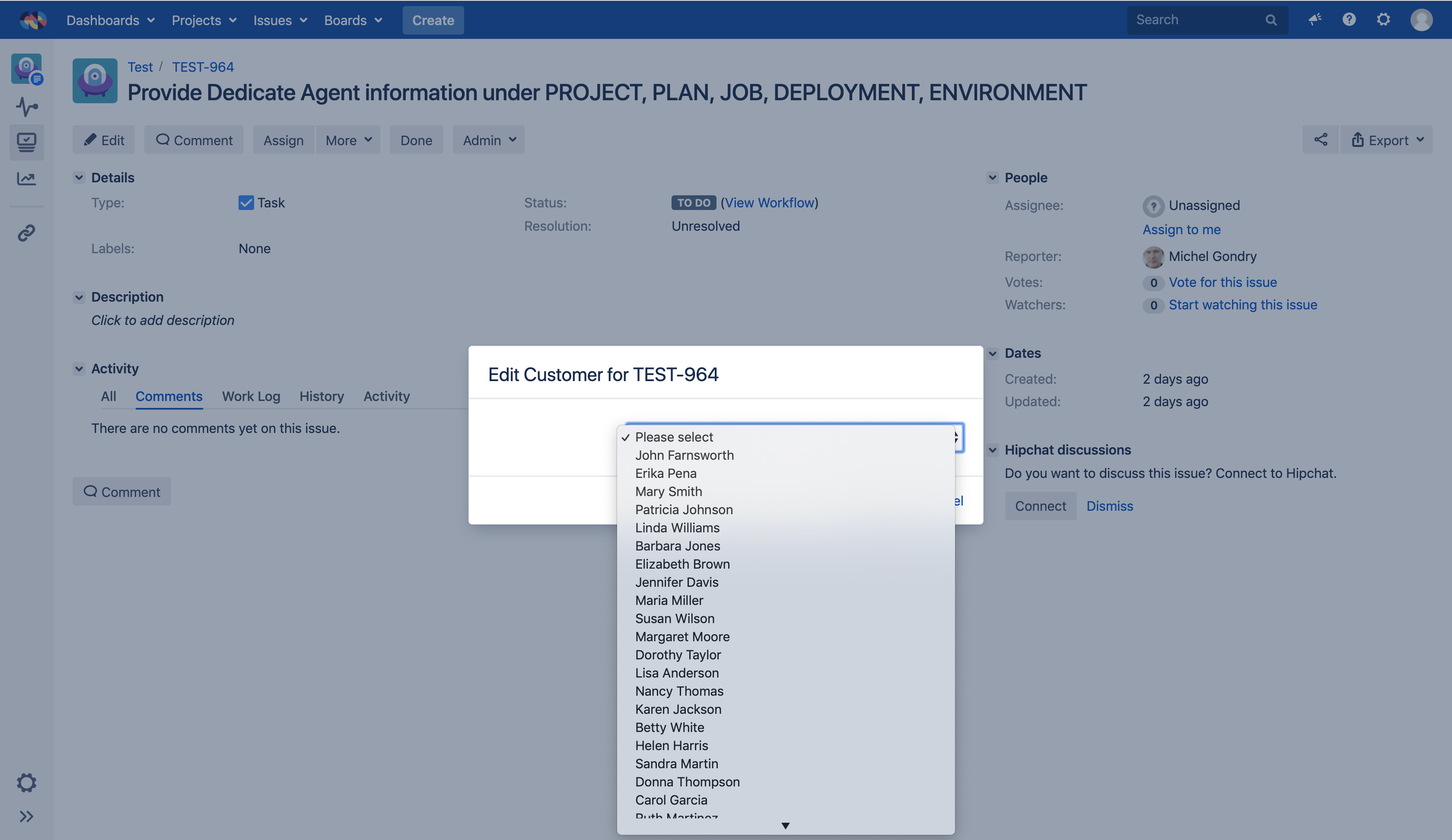
Single Column select list
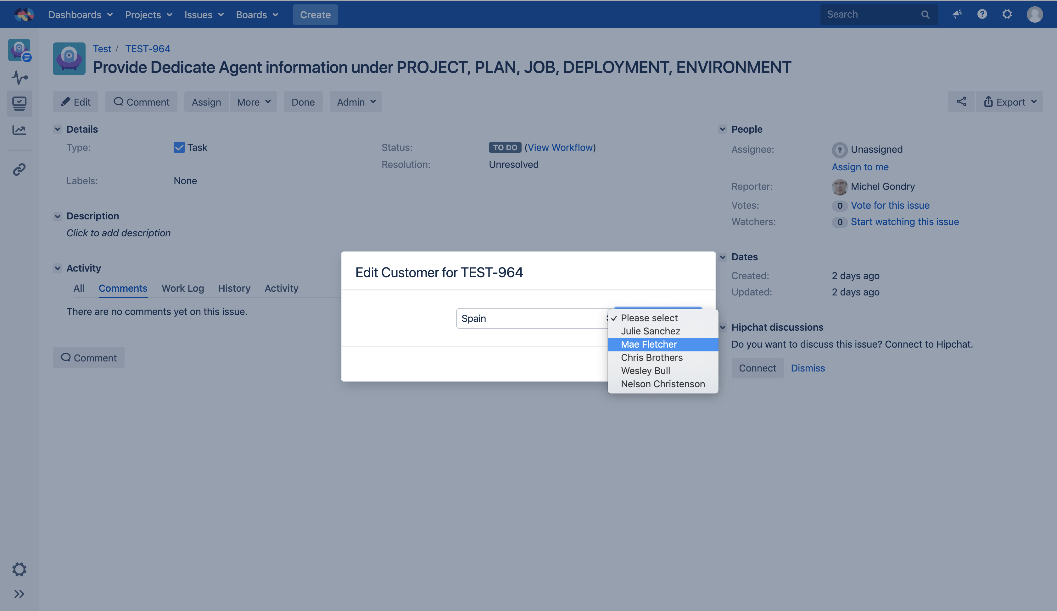
Cascading select list
This editor is rendered as a basic select list. Both single and multiple value modes are available.
This is the only editor that can be set to display values in a cascading mode where users can filter values from the higher level to the single item.
The advantage of this editor is that Elements Connect use the native editor provided by the OS, therefore it renders nicely on any mobile device.
Autocomplete
Supported
Single value MULTI value USER INPUT HTML
Not supported
CASCADING
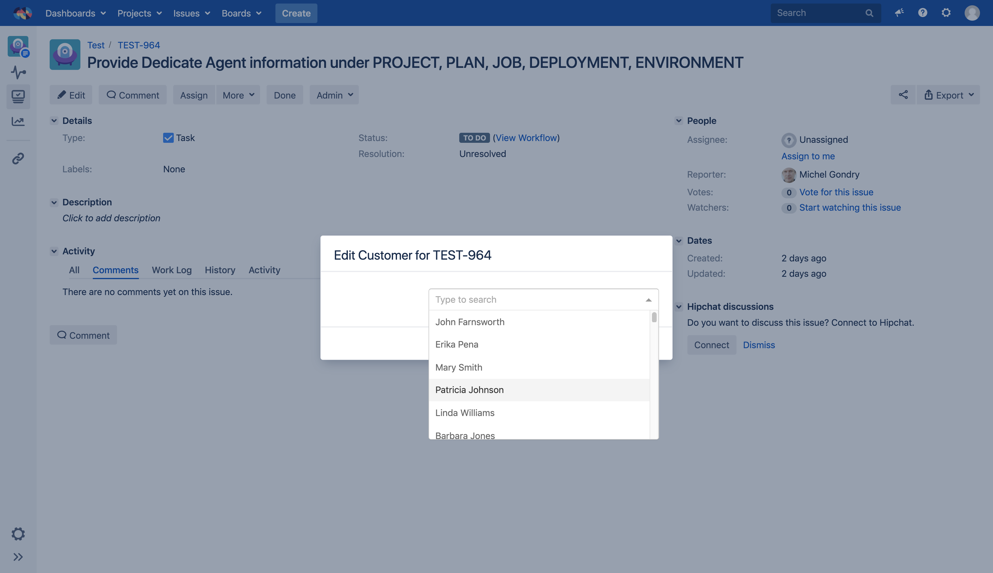
The advantage of the autocomplete editor is that users can filter values by typing in the field.
Therefore, Elements Connect does not have to send all options when the field is loaded and reduces the network latency.
Another advantage is that it supports the $userInput Velocity variable which can be used in the field query.
Read-only
Supported
Single value MULTI value HTML
Not supported
user input CASCADING
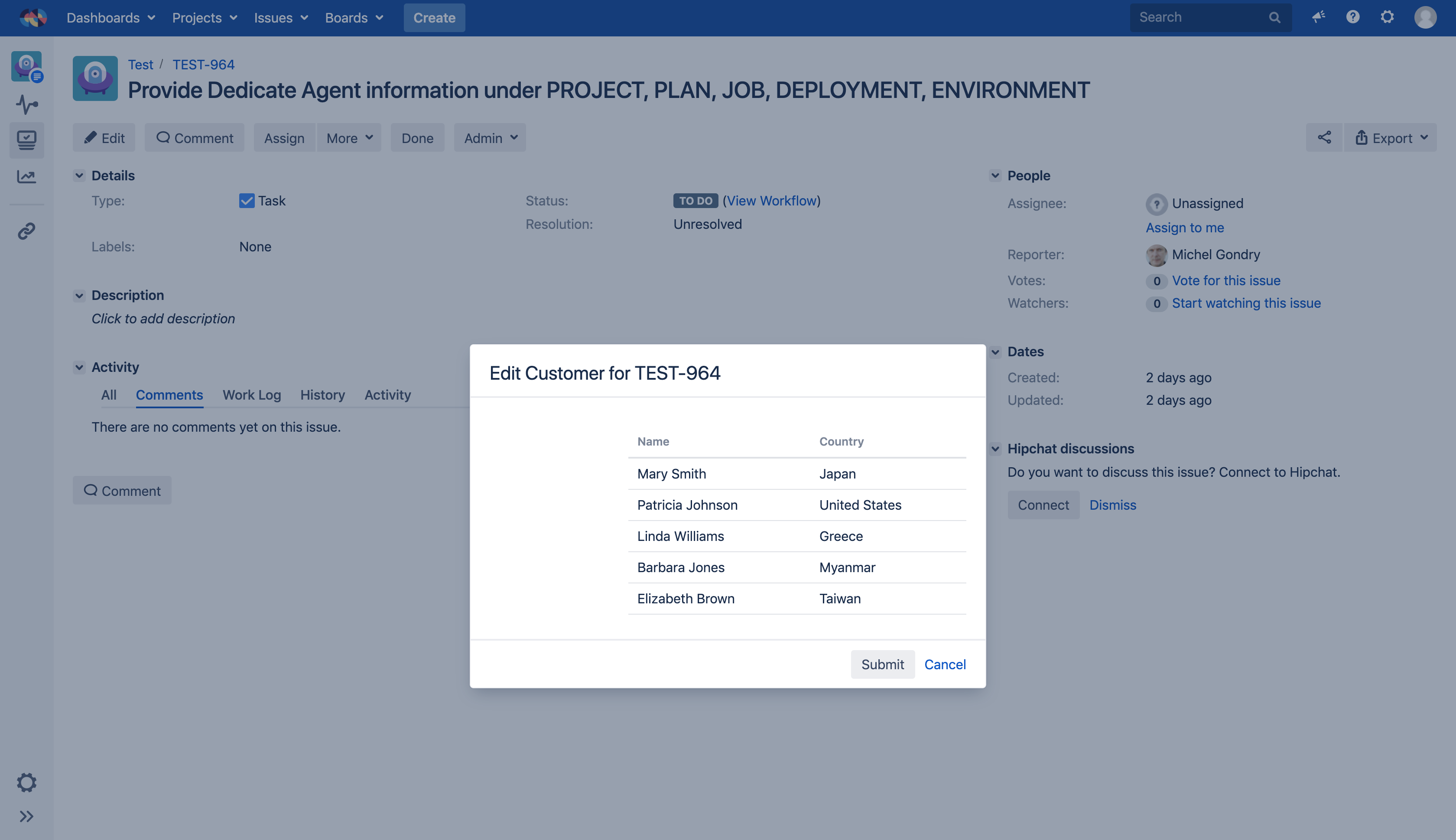
The readonly editor cannot be edited by the user. It just display the data returned by the data source.
It is commonly used to display additional information related to a value selected in another field (which does not have to be a Connect field). For example, display contact information of a customer selected in another field.
Table
Supported
Single value MULTI value
Not supported
user input CASCADING HTML
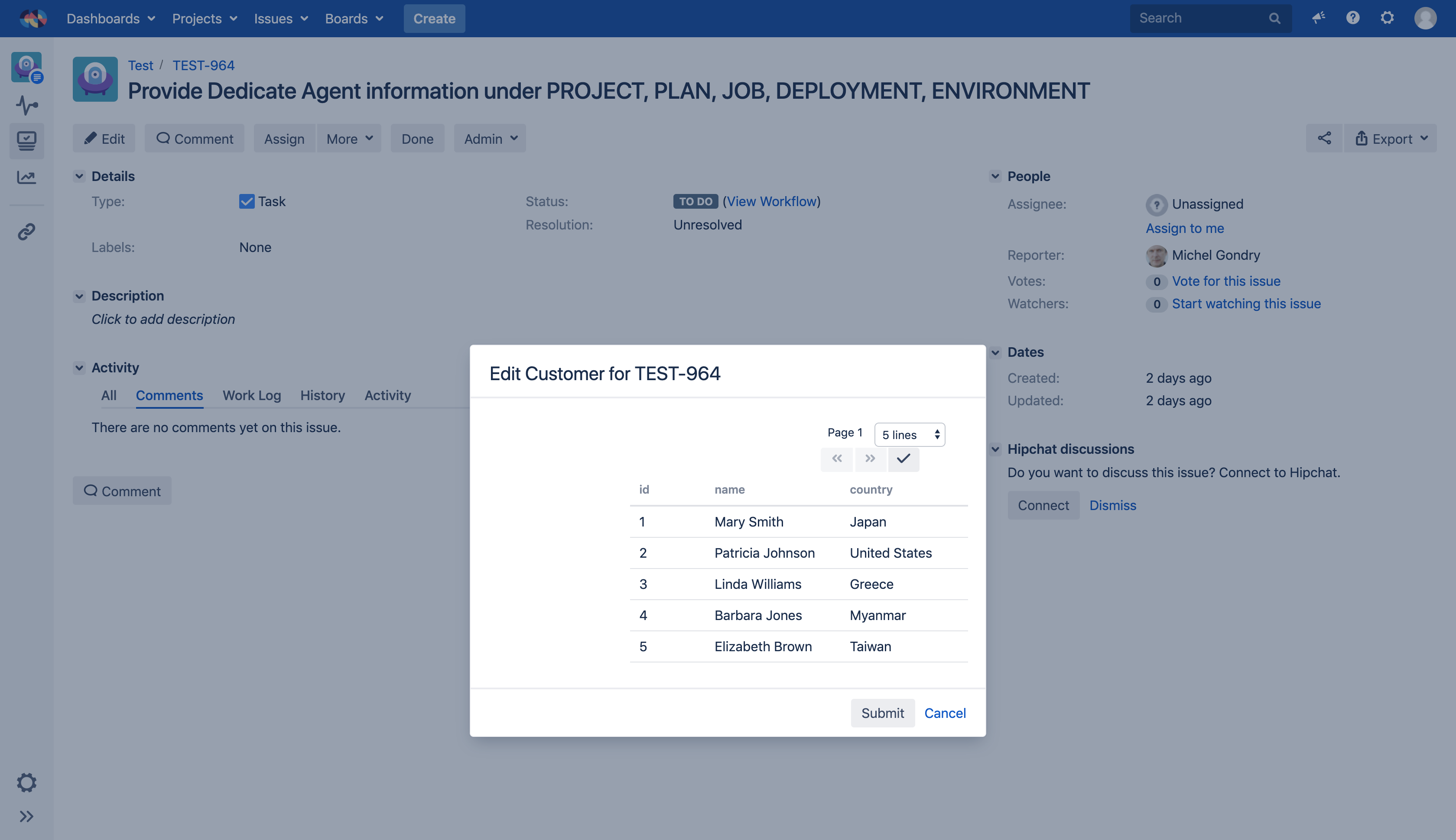
This field display all the query results in a paginated table where users can select options with a checkbox (multi value mode) or by simply clicking on it.
All columns of the result set are displayed in the table editor, you cannot configure them.
Checkbox
Supported
single value HTML
Not supported
USER INPUT Multi values cascading
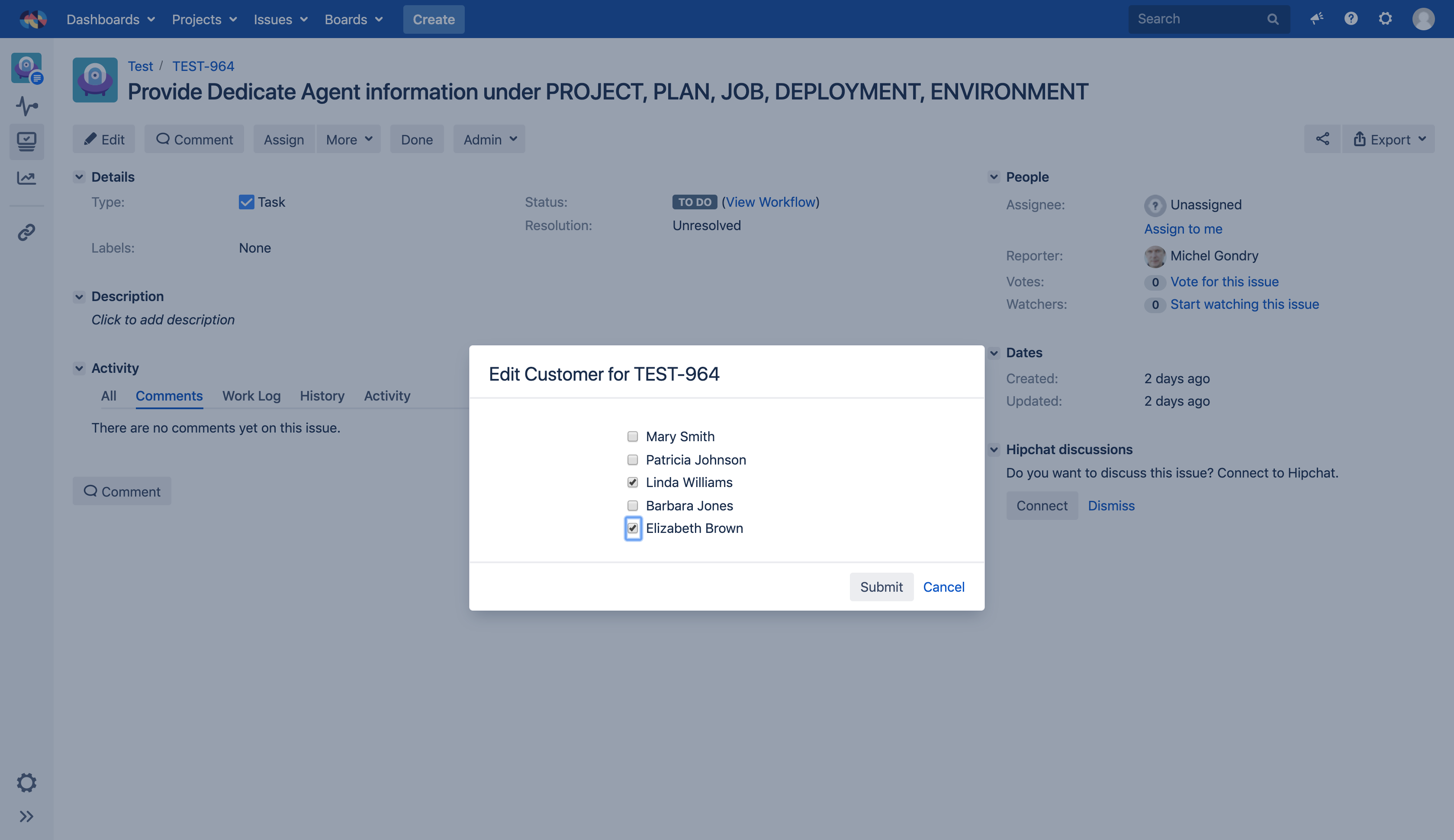
This editor is a nice alternative to the single value Select because it displays all options on screen, and thus have a lower cognitive load.
It works well when the number of options is not too high, ideally three at most but it is commonly accepted to go up to five.
Radio button
Supported
MULTI value HTML
Not supported
USER INPUT single value cascading
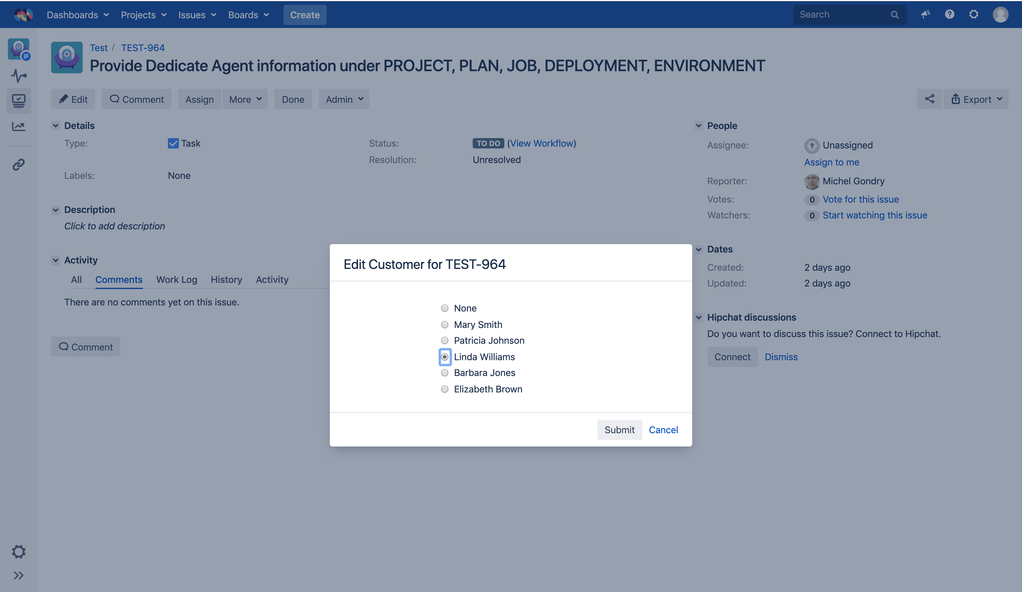
This editor is a nice alternative to the multi value Select because it displays all options on screen, and thus have a lower cognitive load.
It works well when the number of options is not too high, less than 8 for example.
Options
Each editor offers specific options, read more about editors options.
Template
Once you have selected your editor type, you should think about how your end user will see the data. Read more about field template configuration.